Rebecca Wise Studio is the online shop I own and create for. I create hand painted ceramic work, tees and artwork.
The purpose of the branding was to create a cohesive style that matched with my designs/products but that also had a personal touch so that customers could connect to the person behind the brand.
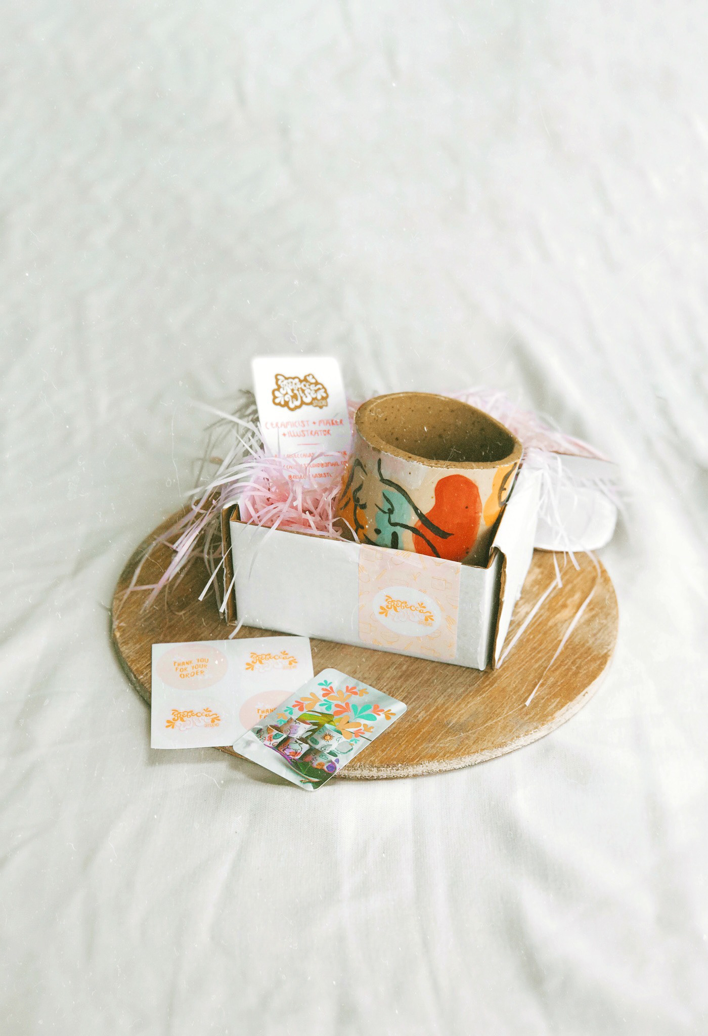
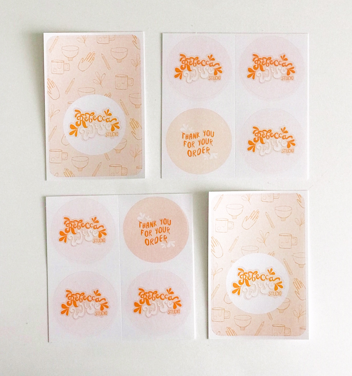
I created a main logo for the brand, business cards and product packaging that included label stickers and stamp designs. All hand illustrated brush lettering designs that were hand rendered into digital illustrations resembling the hand made style of my work.
The branding has three main notes running through it: Bold warm pops of colours, retro/mid century style, hand written look and texture. The pops of colours used such as the burnt orange and coral reflect the bold and warm style of my ceramics and products. The style of lettering used reflects the retro style of the surface designs used on my products. The hand drawn style of the illustrations reflect the textures and hand drawn style that I use in my product designs.
The combination of colours adds a lively and creative look to the branding. The added brush painted lettering texture that runs throughout the branding combined with these colours creates an aesthetic that connects smoothly with the products that I design within my brand.
